How use Adobe Photoshop for Color Analysis
The following guide will cover how to do Quantitative Color Analysis either using Adobe Photoshop alone or with an external tool for deeper analysis.
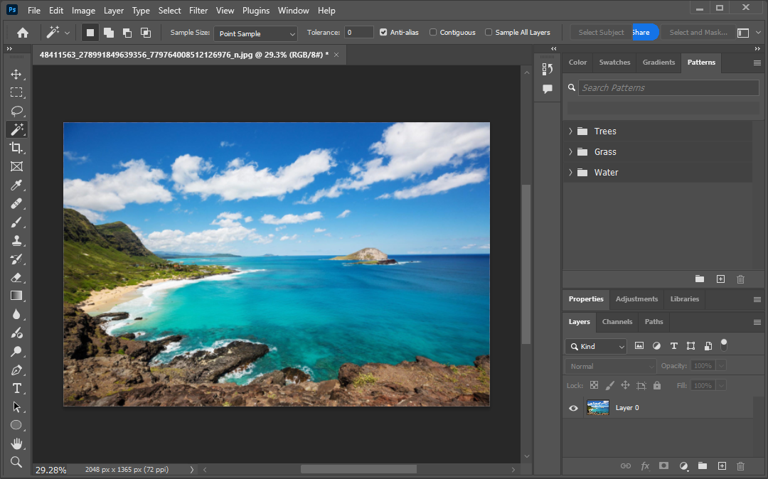
Step 1: Open Your Image in Photoshop
Open your target image (e.g. artwork, design piece, or photo).
Ideally, start with a .jpg or .png file.
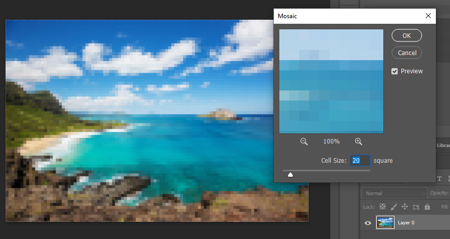
Step 2: Pixelate the Image for Simplification
This step reduces visual complexity by grouping similar pixels together. Think of it like turning your image into digital LEGO blocks. This step makes color regions more uniform and easier to analyze.
Select your image in the layers (bottom right) then at the top, go to
Filter > Pixelate > MosaicSet the Cell Size to around
20 pixels
(You can experiment with 10–50 depending on how much detail you want to keep.) The more detail you retain, the more colors and smaller percentages you will have for analysis.
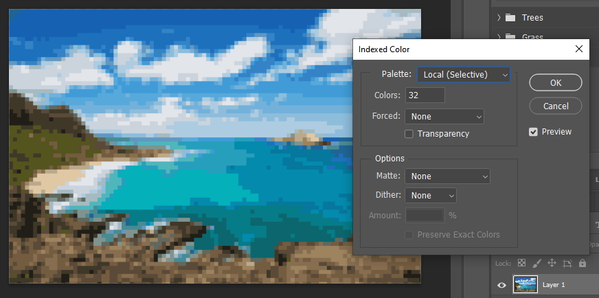
Step 3: Convert the Image to Indexed Color Mode
This step limits the number of colors in the image to a fixed, countable set. It also helps isolate and quantify individual color usage.
At the top go to:
Image > Mode > Indexed Color
Now you'll see a pop-up with several options. Here’s what they mean:
Option | Suggested Setting | Explanation |
|---|---|---|
Palette |
| This tells Photoshop how to pick colors. Either is fine for analysis.
|
Colors |
| Limits image to 32 distinct colors (you can choose fewer like 16 or so, but 32 is good for clarity and control). |
Transparency |
|
|
Forced |
| Prevents Photoshop from adding unnecessary “reserved” colors like pure black or white unless they're already in the image. |
Dither |
| Disabling dithering keeps colors solid instead of mixing pixels to fake gradients, which would mess with analysis. |
Once you hit OK, the image will look a bit posterized (using only a small number of different color tones), this is what we want. Nice job!
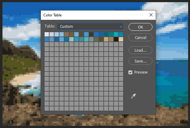
If desired, at this point, you can see the exact colors used.
Image > Mode > Color TableOptional: Screenshot it or export colors manually by saving the table for reference.
(Option A): Quantify colors using Photoshop’s built-in tools
This step outlines how to quantify colors by using built-in tools like the Magic Wand and Histogram, and analyze the results. You’ll identify how many pixels each color uses, calculate what percentage of the image they take up, and organize that data for analysis.
Sub step 1:
First, we need to determine the total pixel count of the image. We can go back to the original file, or go to: Image > Image Size
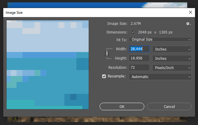
2048 × 1365 = 2,796,720 total pixels
Write this number down as you’ll use it for percentage calculations later.
Sub step 2: Use the Magic Wand Tool to Select a Color
This lets you select all pixels of a specific color across the entire image.
A. Select the Magic Wand Tool
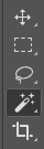
Shortcut:
WOr find it in the toolbar (may be under the Quick Selection tool)
B. Set Tool Options at the Top:

Tolerance:
0→ ensures only the exact color is selectedContiguous: Unchecked → selects all instances of that color in the entire image, not just touching areas
Sample All Layers: Optional, turn ON only if working on merged image layers
C. Click on Any Color Block
Click one of the squares in your mosaic-style image and see the magic happen! 🪄

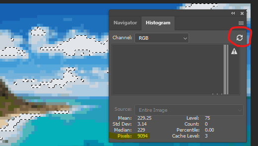
Sub step 3: Find Out How Many Pixels Were Selected
Use the Histogram
Go to:
Window > HistogramMake sure the histogram is set to "Entire Image" be sure click the refresh button to get an accurate count of the selection. (This issue is due to a photoshop quirk showing cached data)
⬇️
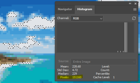
You’ll see a pixel count for the selected color (ex: 151160 pixels)
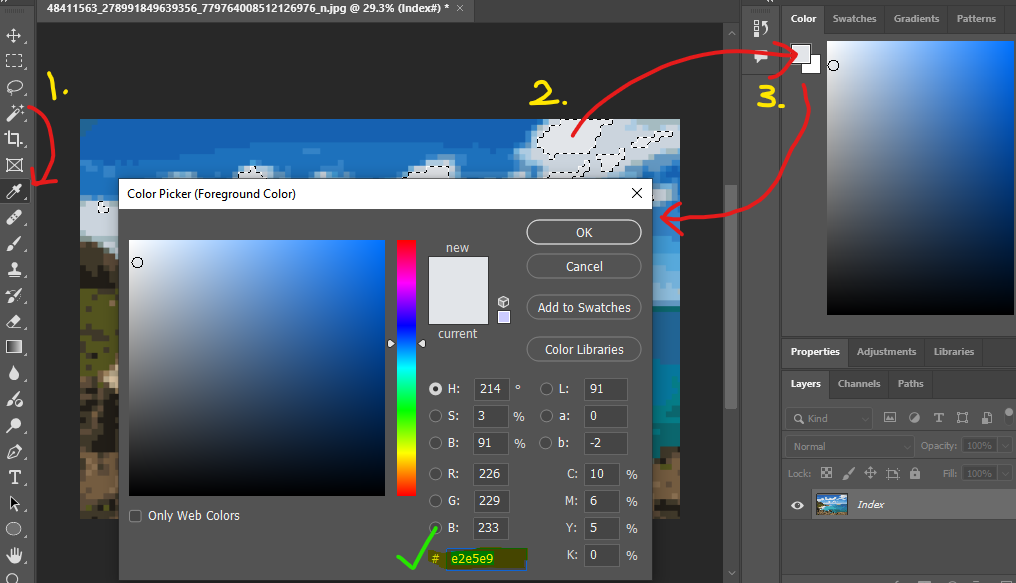
Sub step 4: Calculate Color Percentage
Use this formula: Percentage = (Color Pixel Count / Total Pixels) × 100
(151,160 / 2,796,720) × 100 ≈ 5.4%
You’ll need to repeat at this for the other colors. I would advise creating a like below in a spreadsheet which you can use to visualize the data.
Color (Hex / RGB) | Pixels | % of Image |
|---|---|---|
#e2e5e9 | 151,160 | 5.4% |
... | ... | ... |
You can use the eye dropper tool and then click the foreground square to see the selected color and it’s RGB / Hex value.
(Option B): Online Color Analyzer
This method mentions how to take your modified image and running it through a third party online tool to quickly analyze
Sub step 1:
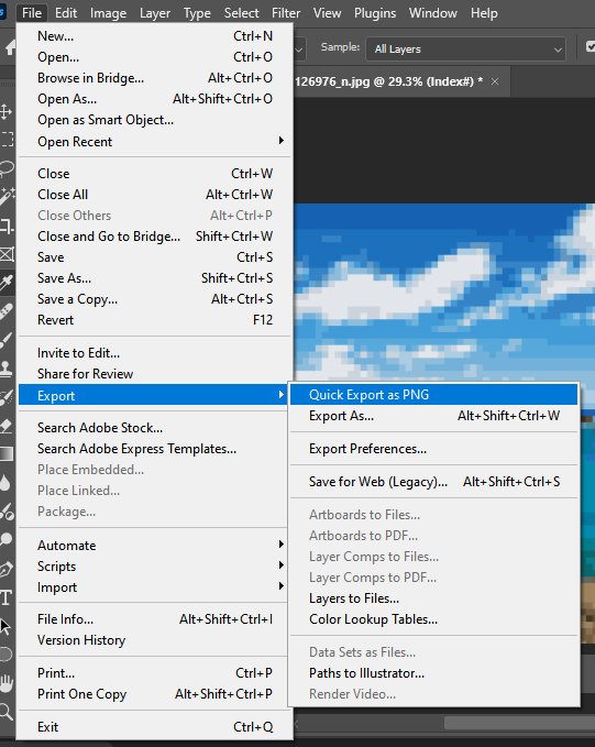
Towards the end Step 3 above, once you have the posterized image in Photoshop, you will need to export it as a PNG to your computer.
Sub step 2: Go to the Color Summarizer Website
🔗 https://mk.bcgsc.ca/color-summarizer/
At the top, click the second tab ‘ANALYZE’
You’ll see a form labeled “Submit Image for Processing.”
Sub step 3: Upload Your Image & Set Options
A. Choose File
Select your
.pngfile that was exported from Photoshop
B. Output Format
Select:
html(easiest to view and copy)
D. Statistics
✅ Check:
color clusters✅ Check:
histogramSkip
pixelunless you want raw pixel-level detail
E. Number of Color Clusters
(Match the number you set in Photoshop during Indexed Color conversion)
In this case where we choose 32 earlier in Photoshop, you’ll select: 20 (which is the maximum allowed on this website)
F. Delimiter
Leave on
space
G. Precision
Choose:
high (150 px)orvhigh (200 px)
(Higher = better accuracy, slower load)
H. Process Image
Wait a few seconds (can take up to 15–30s). The site will then generate a full color summary page.
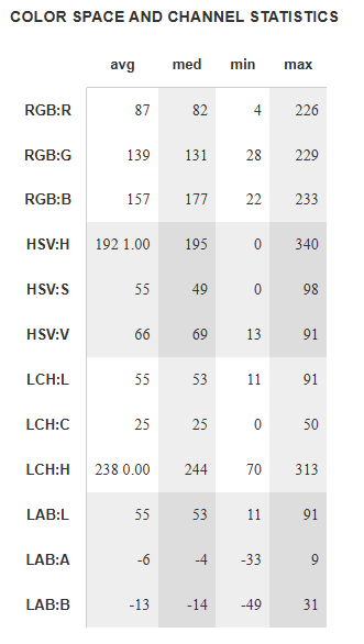
Sub step 4: Understanding the Output
You’ll see a page including table like these. You can copy the data and paste it into a spreadsheet for further analysis. NOTE: Since we converted 32 colors into 20 earlier, some of the RGB/HEX values may have changed.
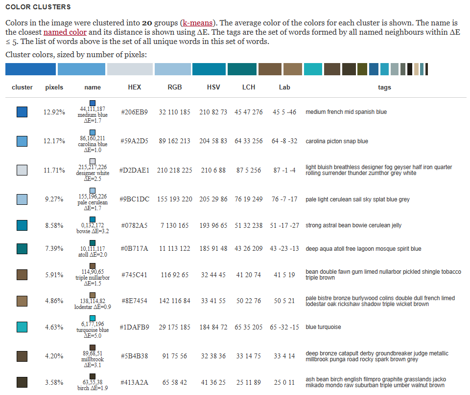
The table below in includes several points of data including:
RGB (Red, Green, Blue)
HSV (Hue, Saturation, Value)
LCH (Lightness, Chroma, Hue)
LAB (Lightness, Green–Red Axis, Blue–Yellow Axis)